Consumer psychology tells you everything you need to know about investing in smarter packaging in 2026. You can spend months perfecting your product, then lose the sale in seconds.
That sounds dramatic. It also reflects how people shop.
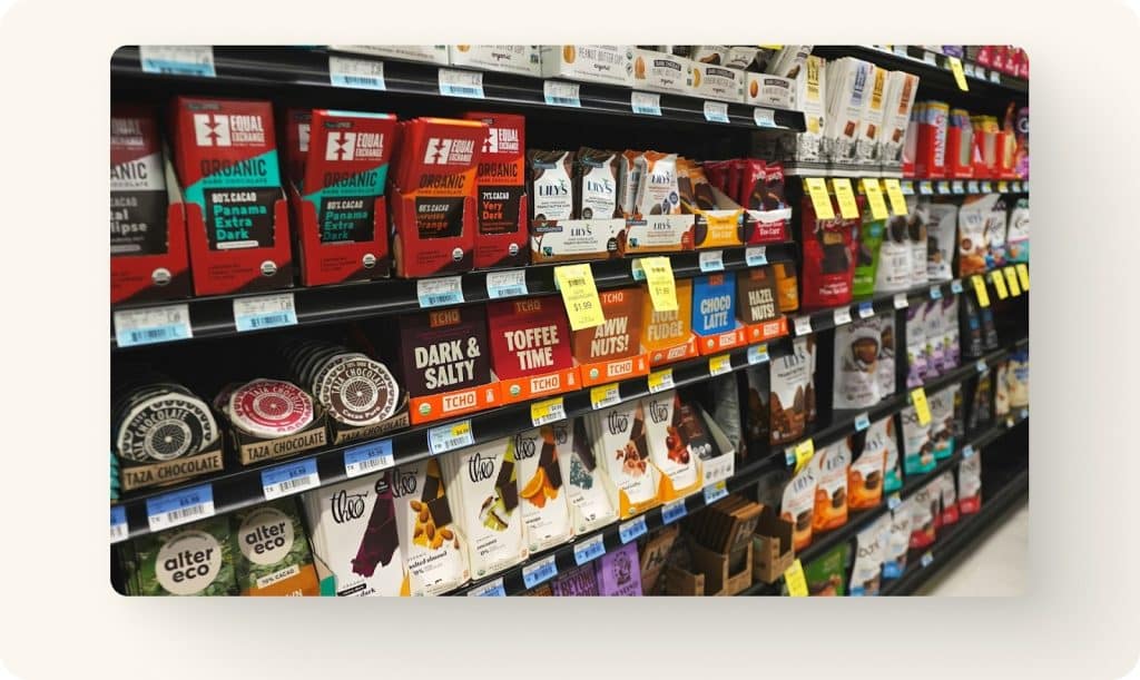
In 2026, packaging psychology matters because shoppers move fast, options feel endless, and “good enough” packaging disappears into the shelf. Brands that win help the brain do three things quickly: notice, understand, and trust.
That’s the job.
Smarter packaging psychology in 2026 starts with speed
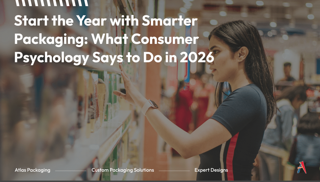
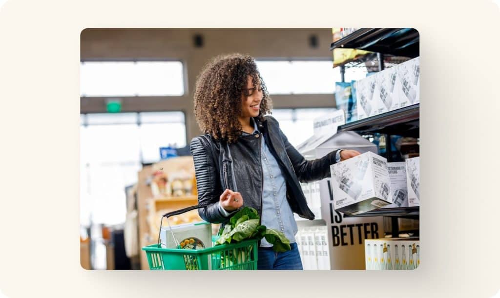
Your customer does not study your packaging. They scan it.
That scan happens in moments. The brain grabs cues like color blocks, contrast, shape, and familiar patterns. Then it decides whether your product earns the next second of attention.
You can design for that. Working with a custom packaging supplier can help.
Here’s a simple exercise we recommend. Look at your current packaging from six feet away. What stands out first? If the answer feels unclear, the shopper has the same experience.
The fastest improvement most brands can make is tightening their visual hierarchy.
Visual hierarchy: make the first read effortless
Visual hierarchy is the order your packaging gets read. When it works, it feels automatic.
A strong front panel makes three things clear right away: what the product is, who it’s for, and why it’s worth choosing. When those answers compete for attention, the shopper moves on.
This is where many packages break down. Too many claims. Too many badges. Too much copy trying to convince instead of clarify.
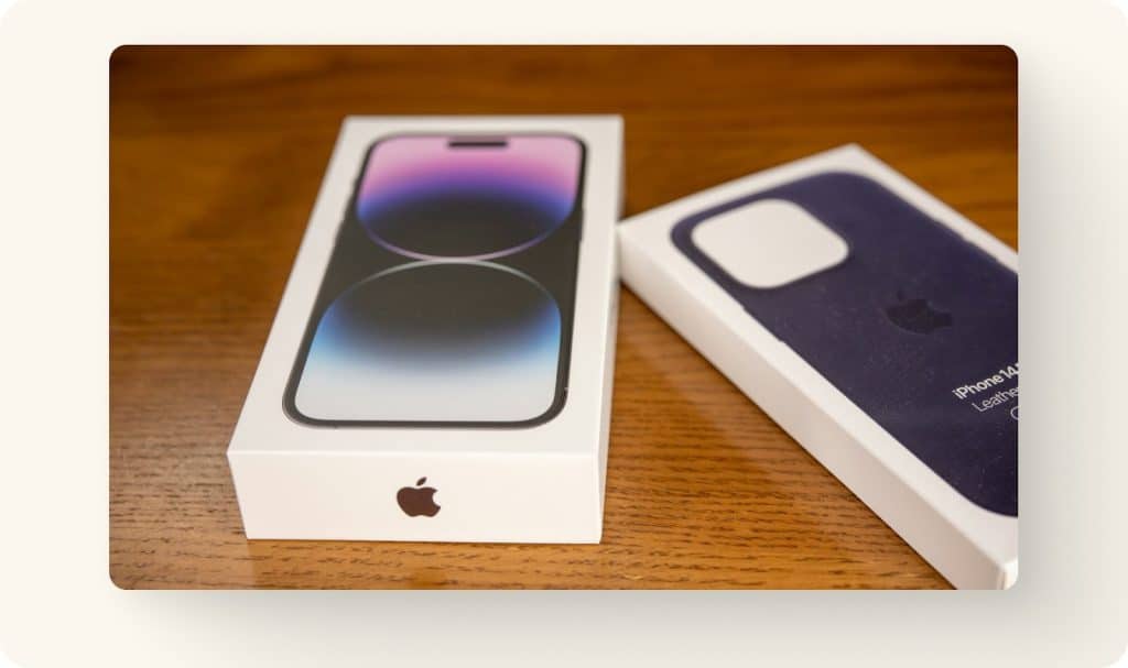
Look at Apple’s packaging. It isn’t loud. It’s precise. The box reinforces beauty and removes all doubt about expectations. That’s the real purpose of hierarchy. It lowers decision friction. In Apple’s case, the front of the box often contains nothing but the product itself.
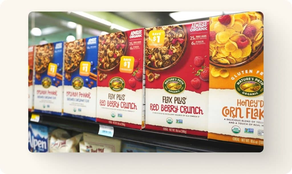
Color: stop guessing and start validating
Color carries meaning before a single word gets read. People form impressions instantly, and color often does more work than copy.
You do not need to master color theory. You need intention.
Ask whether your colors match the feeling you want associated with the product. Ask whether they align with category expectations or break the pattern in a deliberate way. Ask whether they stay consistent across SKUs so shoppers can recognize you quickly.
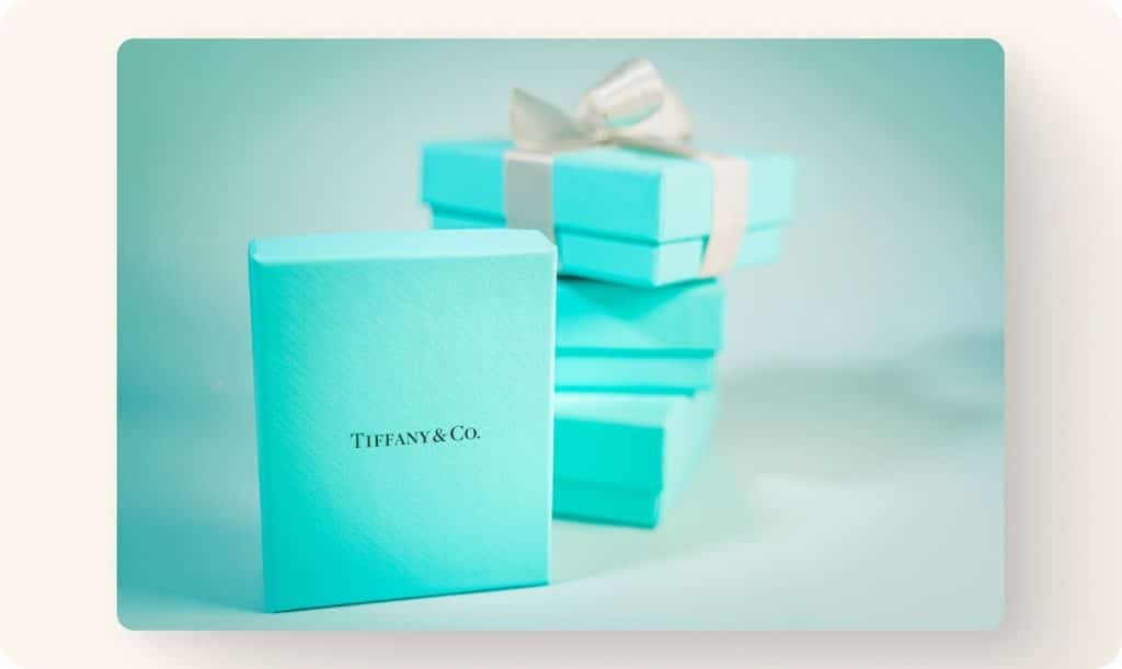
Coca-Cola’s red and Tiffany’s blue work because they repeat, not because they are clever. You can create the same effect at a smaller scale with a consistent layout and a strong accent color.
A practical Q1 move is to test before you print. Run two color versions in digital ads or on your product page. Watch click-through rate, add-to-cart behavior, and time on page. Let real behavior guide the decision before committing to a production run.
Typography: clarity beats clever for true smarter packaging
Typography is not decoration. It’s comprehension.
If your type is hard to read at shelf distance, you lose the “understand” step. Once that breaks, trust never forms.
Two quick checks catch most issues. Print the front panel, tape it to a wall, and step back six feet. If you cannot read the product name and key differentiator, simplify. Then show the package to someone for three seconds and ask what it was. Hesitation is a signal.
Serif versus sans-serif matters far less than spacing, contrast, and restraint. Typography still signals personality, but that signal needs to support the product, not compete with it.
Perceived value starts before the package is opened
People judge quality visually and tactically. Weight, rigidity, texture, and finish all communicate before copy does.
That’s why luxury brands invest in how packaging feels. The customer reads “premium” before opening the box.
You can apply the same psychology without blowing your budget. Upgrade one touchpoint. Remove unnecessary visual clutter. Improve one functional detail like opening, resealing, or dispensing.
Perceived value comes from coherence. When a premium product shows up in flimsy packaging, doubt creeps in. Doubt kills conversion.
Structure: reduce friction before it becomes regret for smarter packaging in 2026
Structure is psychology too.
A package that is awkward to hold, hard to open, or annoying to store creates friction. Friction becomes irritation. Irritation becomes “I’m not buying this again.”
Small choices matter here. Resealable features, easy-pour designs, and stackable formats all reduce effort. They also make products feel considered.
Retail reality matters as well. Packaging has to survive shipping, stocking, and real shelves. If retail is part of your 2026 packaging strategy, thinking beyond the primary package into retail-ready or display formats early can prevent rework later.
Use consumer neuroscience without pretending you run a lab
You do not need brain scans to use psychology well. You need simple, repeatable tests that reflect real decisions.
Change one variable at a time. Test two versions. Ask which one people would choose and why. Compare their reasoning to your intent.
Research on visual attention consistently shows that small design changes can shift preference. The goal is not perfection. It’s direction.
Pairing testing with a packaging partner who understands printing limits, materials, fulfillment wear, and display constraints keeps those insights practical.
A simple way to start your smarter packaging refresh in 2026
If you are planning a rebrand, a new SKU, or a packaging update this year, focus on clarity first. Make the first read obvious. Make the main claim easy to believe. Make the product feel worth its price. Make the experience easy after purchase. Test before you scale.
Ask one final question.
If your packaging sat beside your top competitor, would a first-time buyer understand your difference in three seconds?
If that answer feels uncertain, you have your Q1 project.
Packaging psychology is not magic. It’s design that respects how people actually choose.