Retail display design isn’t about filling space. It’s about stopping shoppers, holding their attention, and driving sales. Point-of-purchase (POP) displays can lift sales by double digits when they’re executed well. But too many displays fade into the background.
If you want your POP displays to work, you need more than graphics and cardboard. You need a strategy grounded in shopper psychology, smart placement, and clear messaging. Here’s how to build displays that stand out in-store.
Understand Shopper Psychology
Shoppers make quick decisions. Research shows they notice a display in just a few seconds before deciding to move on or engage. That means your display has to do two things: capture attention and communicate a message instantly.
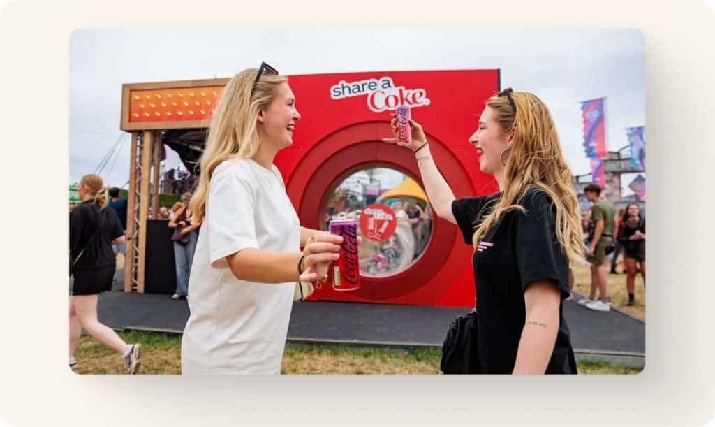
The human brain is wired to respond to contrast, simplicity, and novelty. Displays overloaded with products or text can overwhelm and lose impact. Displays with one bold idea—like Coca-Cola’s simple “Share a Coke” endcaps—make it easy for shoppers to understand the offer and act on it.
Think about what your shopper is feeling at the moment of purchase. Are they looking for convenience, excitement, or reassurance? Design your retail display around that core motivation.
Placement Is Everything For Your Retail Display
Even the best display won’t sell if it’s hidden in a low-traffic aisle. Placement is a critical factor in POP display success.
Prime spots include:
- Endcaps that face main aisles
- Checkout areas for impulse items
- High-traffic zones near seasonal promotions
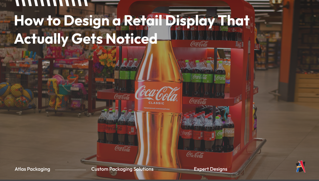
Brands like Hershey’s place compact displays right by registers to capture last-minute purchases. Larger displays from brands like Procter & Gamble’s laundry detergent dominate aisle ends where shoppers are already looking for household essentials.
When planning your retail display design, map out the shopper’s path through the store. Displays placed along natural traffic patterns perform better than those tucked away.
Messaging Hierarchy and Clarity
Your display should communicate one main idea. Shoppers don’t have time to read three competing taglines. A clear hierarchy of messaging helps guide the eye:
- Headline: the big benefit or offer
- Supporting copy: a short phrase that adds context
- Call to action: what you want them to do (buy now, try today, limited time)
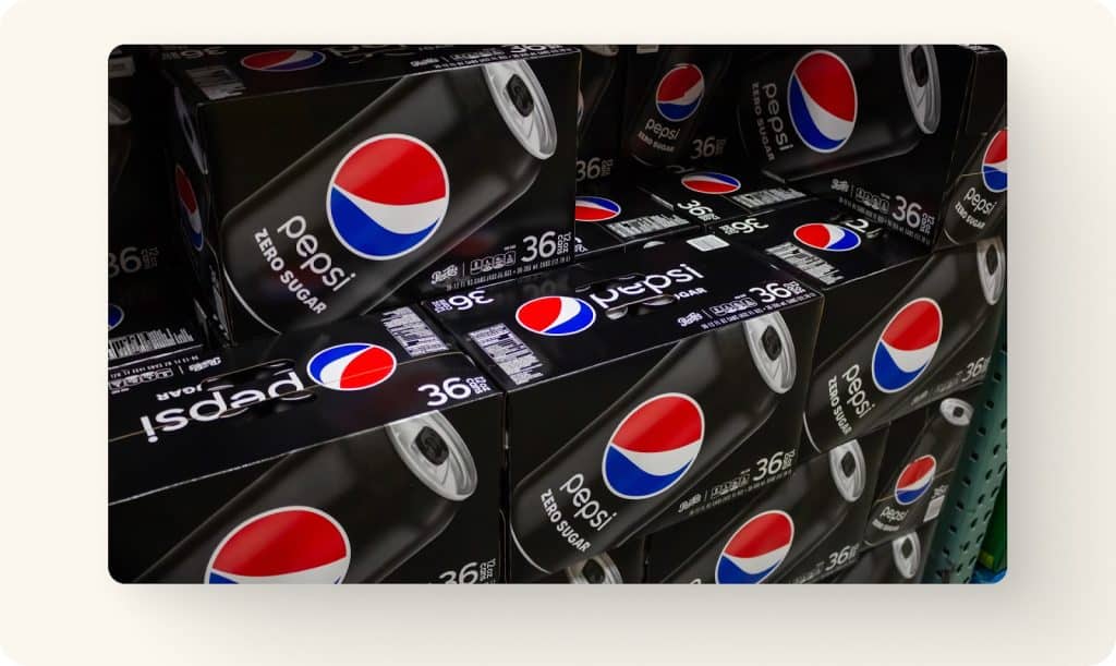
PepsiCo, for example, often uses one bold benefit like “Zero Sugar” in oversized type, with minimal supporting text. That clarity ensures the key selling point hits in seconds, whether it’s on the display or on the retail packaging itself.
Before you finalize your design, ask: If a shopper walks past at normal speed, what message do they take away? If it’s not crystal clear, refine until it is.
Visual Elements in Your Retail Display: Color, Layout, and Structure
Color is one of the most powerful tools in retail display design. Warm colors like red and orange create urgency. Cool colors like blue and green suggest calm or sustainability. Using brand-consistent colors reinforces recognition while still drawing the eye.
Layout also matters. Too much clutter and the display becomes noise. Too much empty space and it looks unfinished. Balance is the goal. The design should direct the shopper’s gaze from headline, to product, to call to action.
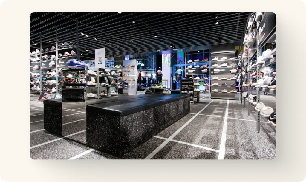
Structural features can turn a static display into an engaging one. Shelves, hooks, or cut-outs encourage shoppers to reach in and interact. Nike has used layered shoe towers that invite shoppers to touch and try, while beauty brands often add testers or sample trays.
Keep these principles in mind:
- Bright but brand-consistent colors
- Balanced use of space
- Interactive elements to invite touch
POP Displays as a Brand Experience
Every display is more than a sales tool, it’s a piece of your brand. Shoppers should recognize your values the moment they see it.
Apple stores are a great example. Their displays are simple, clean, and consistent with the brand’s promise of sleek, premium design. On the other end of the spectrum, natural food brands often use recycled board or earthy colors in displays to signal sustainability.
Consistency matters. Your display should match your packaging, ads, and website. That cohesion makes your brand easier to recognize and trust.
Atlas Packaging works with clients to create POP displays that not only sell products but also reinforce brand identity in-store. From seasonal corrugated displays to permanent retail fixtures, the focus is always on brand alignment and shopper engagement.
Measuring Success With a Retail Display
A retail display isn’t successful just because it looks good. You need to track performance. The most common metric is sales lift compared to baseline. If your display does not move more product than before, it is not doing its job.
Another important measure is dwell time, which is the length of time shoppers stop and engage with the display. Longer dwell time usually signals stronger interest and a higher chance of conversion.
You should also look closely at conversion rate. This is the percentage of shoppers who buy after engaging with the display. It gives you a clear picture of how well your design is turning attention into sales.
Many brands test different headlines, colors, or placements to see what performs best. Even small changes, such as moving a display from waist height to eye level, can make a measurable difference.
Retail Displays Require a Clear Strategy
Retail display design is about strategy, not guesswork. When you understand shopper psychology, place your displays where they matter, keep the message clear, and tie everything back to your brand, your POP displays can transform from space fillers to sales drivers.
Atlas Packaging partners with brands to design and produce displays that grab attention and move products. Get in touch with us today to learn more.